We have seen in the previous section that our model didn’t appear suitable for our data. In the lecture slides, we propose the following alternative model:
\[
\text { Score }_i=\beta_0+\beta_1 \text { Group }_i+\beta_2 \text { Age }_i+\beta_3 \text { Group }_i \text { Age }_i+\epsilon_i, \quad \epsilon_i \stackrel{i i d}{\sim} \mathcal{N}\left(0, \sigma^2\right)
\]
The parameters of this second model can be estimated as follows:
import pandas as pdimport matplotlib.pyplot as pltimport statsmodels.formula.api as smfimport numpy as npimport scipy.stats as statsreading = pd.read_csv("https://raw.githubusercontent.com/ELSTE-Master/Data-Science/main/Data/reading.csv")# Fit the linear model: score ~ group + agemod2 = smf.ols('score ~ group*age', data=reading).fit()print(mod2.summary())
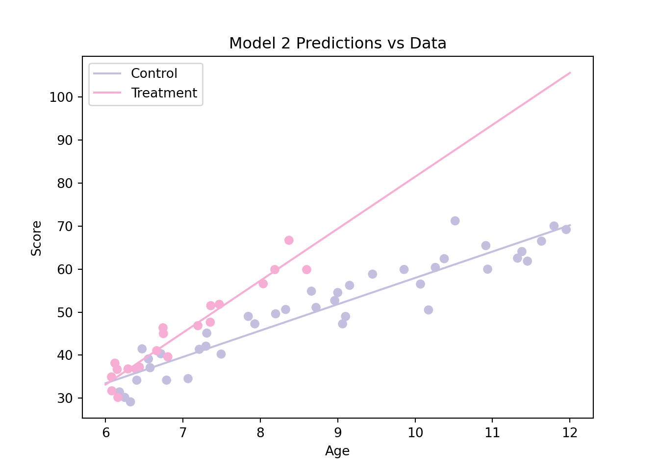
Based on this graph, our second model appears to be more adequate than our first model. We can also compare the AIC of these two models as follows:
# Compare AICs of Model 1 and Model 2print("AIC(mod1):", round(mod1.aic,2))
AIC(mod1): 352.27
print("AIC(mod2):", round(mod2.aic,2))
AIC(mod2): 326.91
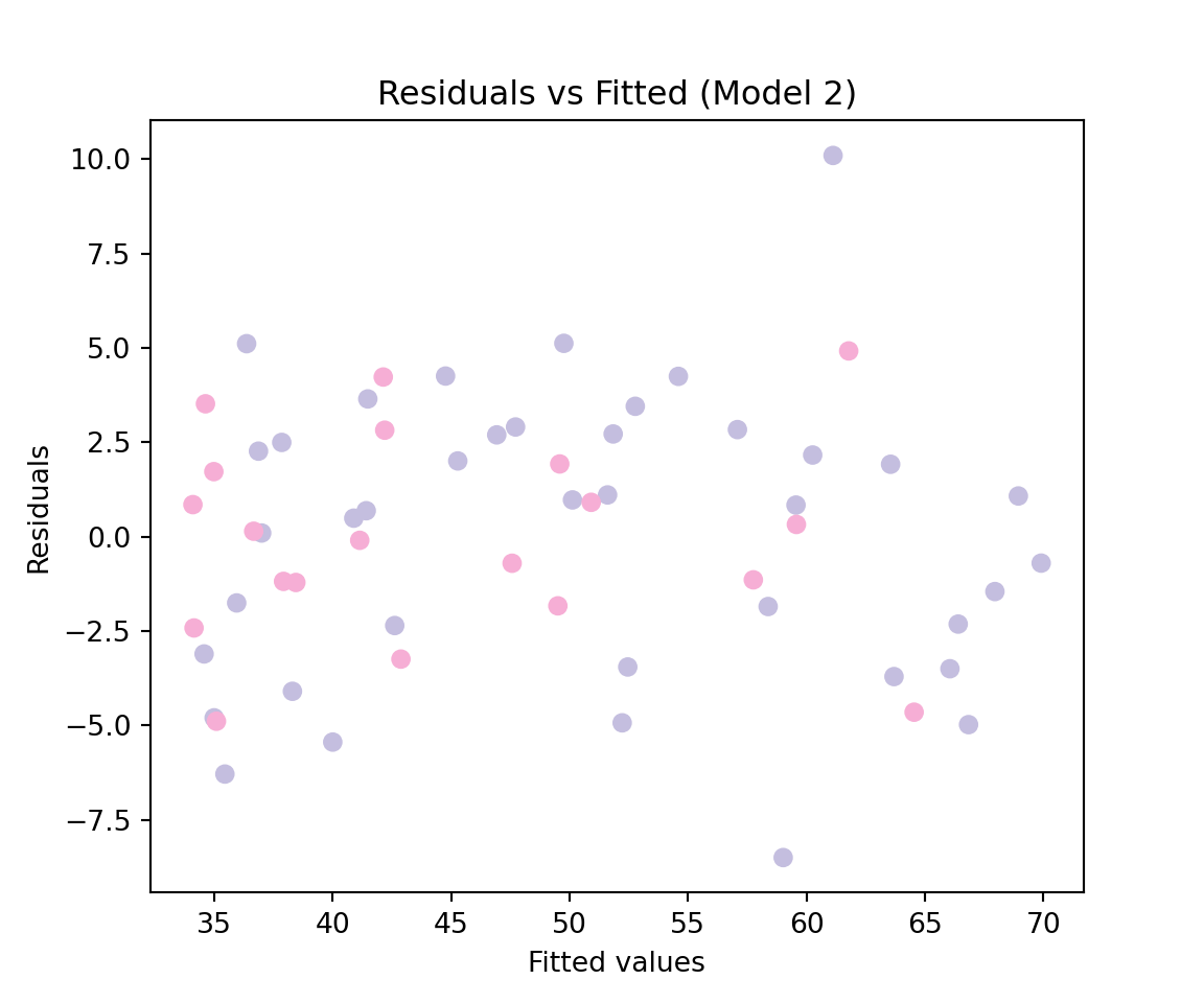
This approach also suggests that the second model is more adequate. Similarly to what we did previously, we can construct the model diagnostic graphs as follows:
import scipy.stats as stats# residuals vs fitted values for Model 2colors = {'Control': '#c4bedf','Treatment': '#f6aed5'}group_col = reading["group"].map(colors)plt.figure(figsize=(6, 5))plt.scatter(mod2.fittedvalues, mod2.resid, c=group_col)plt.xlabel("Fitted values")plt.ylabel("Residuals")plt.title("Residuals vs Fitted (Model 2)")plt.show()
# Q–Q plot for residuals (Model 2) plt.figure(figsize=(6, 5))(osm, osr), (slope, intercept, r) = stats.probplot(mod2.resid, dist="norm")# Black dotsplt.scatter(osm, osr, color='black', s=20)# Black reference lineplt.plot(osm, slope * osm + intercept, color='black', linewidth=1.5)plt.title("Normal Q–Q Plot of Residuals")plt.xlabel("Theoretical Quantiles")plt.ylabel("Sample Quantiles")plt.show()
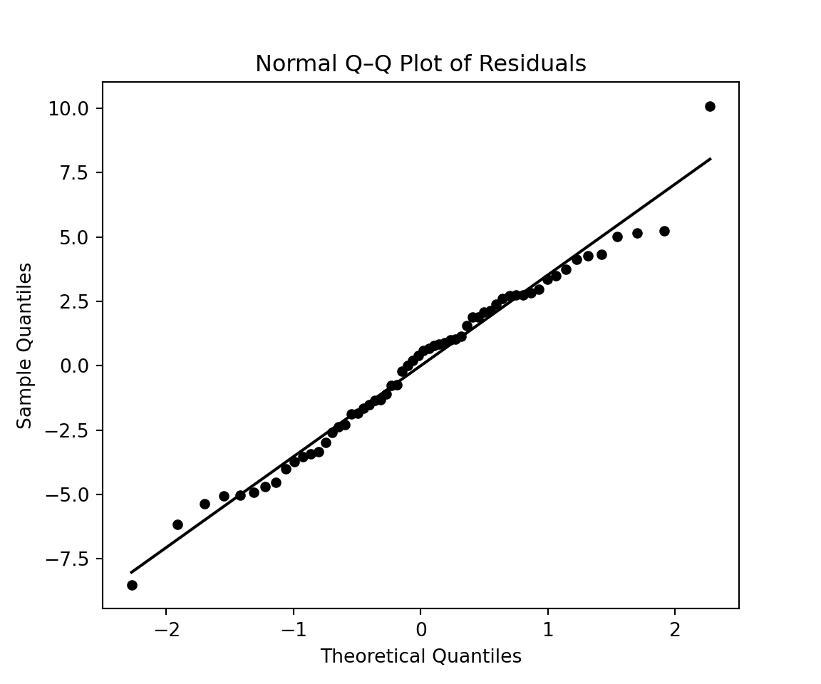
Both graphs suggest that the model is a reasonable approximation for the data we considering. However, in the lecture slides we consider a third model which is given by:
\[
\text { Score }_i=\beta_0+\beta_1\left(\text { Age }_i-6\right)+\beta_2 \text { Group }_i\left(\text { Age }_i-6\right)+\epsilon_i, \quad \epsilon_i \stackrel{i i d}{\sim} \mathcal{N}\left(0, \sigma^2\right)
\]
To consider this model we first need to construct the variable “Age - 6”, which can be done as follows:
# Create the variable age_minus_6reading["age_minus_6"] = reading["age"] -6
Then, the parameters of this third model can be estimated as follows:
# Fit the modelmod3 = smf.ols("score ~ age_minus_6 + group:age_minus_6", data=reading).fit()print(mod3.summary())
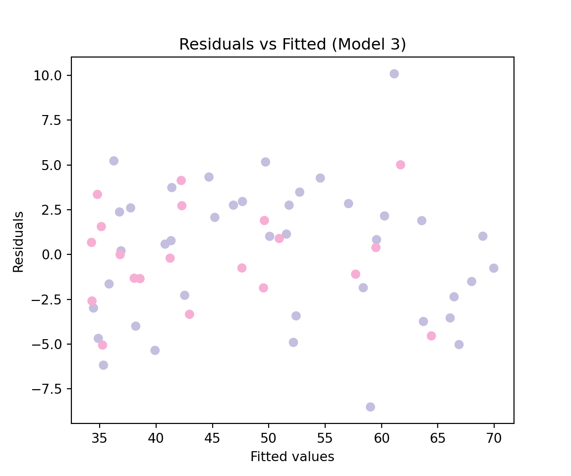
Based on this graph, our third model appears to be a better fit compared to the second model. We can also compare the AIC of the models we have considered as follows:
# Compare AICs of the three modelsprint("AIC(mod1):", round(mod1.aic,2))
AIC(mod1): 352.27
print("AIC(mod2):", round(mod2.aic,2))
AIC(mod2): 326.91
print("AIC(mod3):", round(mod3.aic,2))
AIC(mod3): 324.95
This approach suggests that the third model is the most adequate among all three models we have considered. Finally, we can construct the model diagnostic graphs as follows:
# Diagnostic plots for Model 3 plt.figure(figsize=(6, 5))plt.scatter(mod3.fittedvalues, mod3.resid, c=group_col)plt.xlabel("Fitted values")plt.ylabel("Residuals")plt.title("Residuals vs Fitted (Model 3)")plt.show()
# QQ plot for residuals of Model 3 plt.figure(figsize=(6, 5))(osm, osr), (slope, intercept, r) = stats.probplot(mod3.resid, dist="norm")# Black dotsplt.scatter(osm, osr, color='black', s=20)# Black reference lineplt.plot(osm, slope * osm + intercept, color='black', linewidth=1.5)plt.title("Normal Q–Q Plot of Residuals")plt.xlabel("Theoretical Quantiles")plt.ylabel("Sample Quantiles")plt.show()