import pandas as pd
import matplotlib.pyplot as plt
import statsmodels.formula.api as smf
import numpy as np

reading = pd.read_csv("https://raw.githubusercontent.com/ELSTE-Master/Data-Science/main/Data/reading.csv")

# Fit the linear model: score ~ group + age
mod1 = smf.ols('score ~ group + age', data=reading).fit()

# Fitted values
fitted_values = mod1.fittedvalues

# Residuals
residuals = mod1.residExample reading data: model diagnostic
In this section, we consider the construction of model diagnostic graphs discussed in the lecture slides. The first graph compares the fitted values (i.e the predictions) with the residuals of the model. The fitted values and the residuals of the model can be computed as follows:
Then, we can construct the graph as follows:
plt.figure(figsize=(6, 5))
plt.scatter(fitted_values, residuals, color='steelblue', alpha=0.8)
plt.axhline(0, color='gray', linestyle='--', linewidth=1)
plt.xlabel("Fitted values")
plt.ylabel("Residuals")
plt.title("Residuals vs Fitted Values")
plt.show()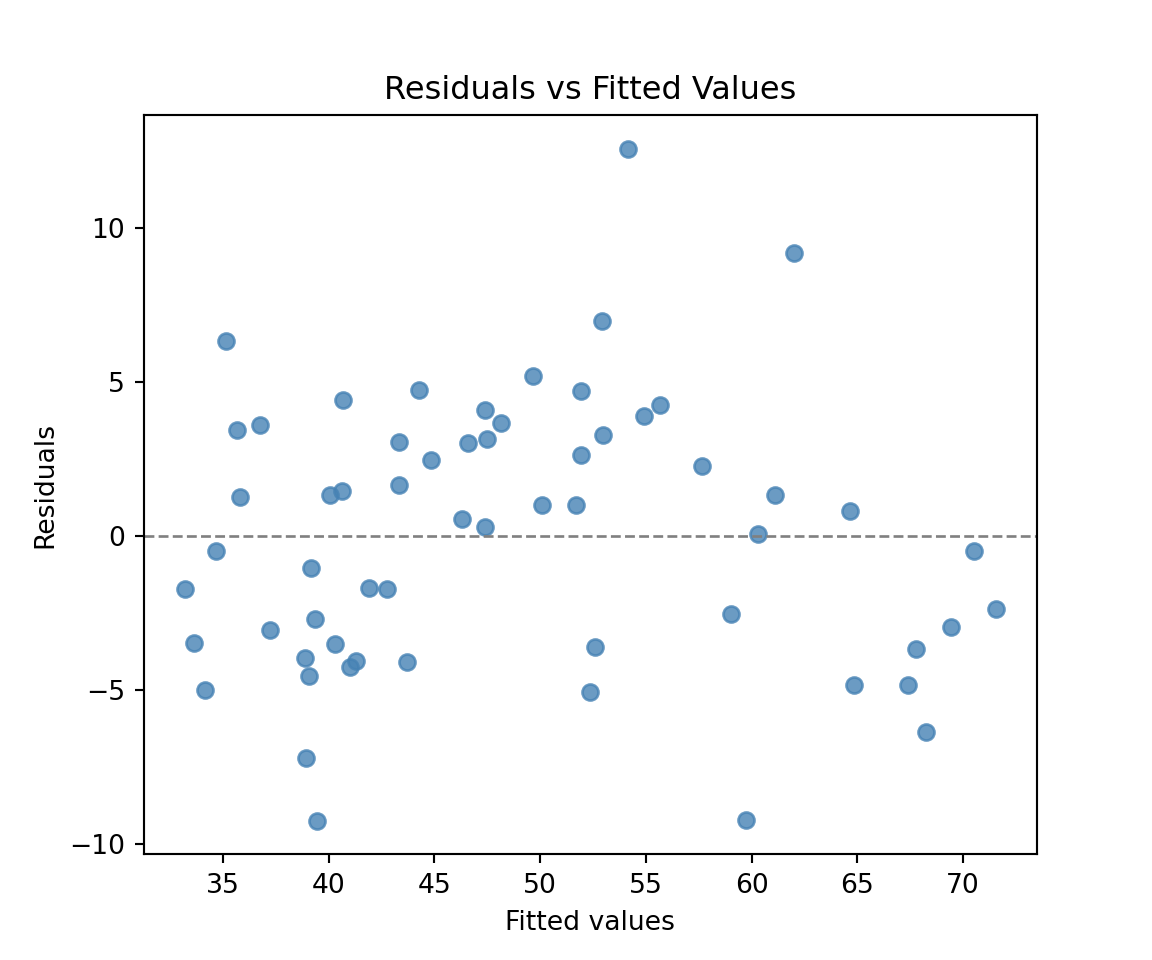
Similarly to what we did before, we can also add different colors to compare the groups:
# Define colors for groups
colors = {
    'Control': '#c4bedf',
    'Treatment': '#f6aed5'
}

plt.figure(figsize=(6, 5))
for g in reading['group'].unique():
    subset = reading[reading['group'] == g]
    plt.scatter(
        fitted_values[reading['group'] == g],
        residuals[reading['group'] == g],
        color=colors[g], label=g, alpha=0.8
    )

plt.axhline(0, color='gray', linestyle='--', linewidth=1)
plt.xlabel("Fitted values")
plt.ylabel("Residuals")
plt.title("Residuals vs Fitted Values by Group")
plt.legend()
plt.show()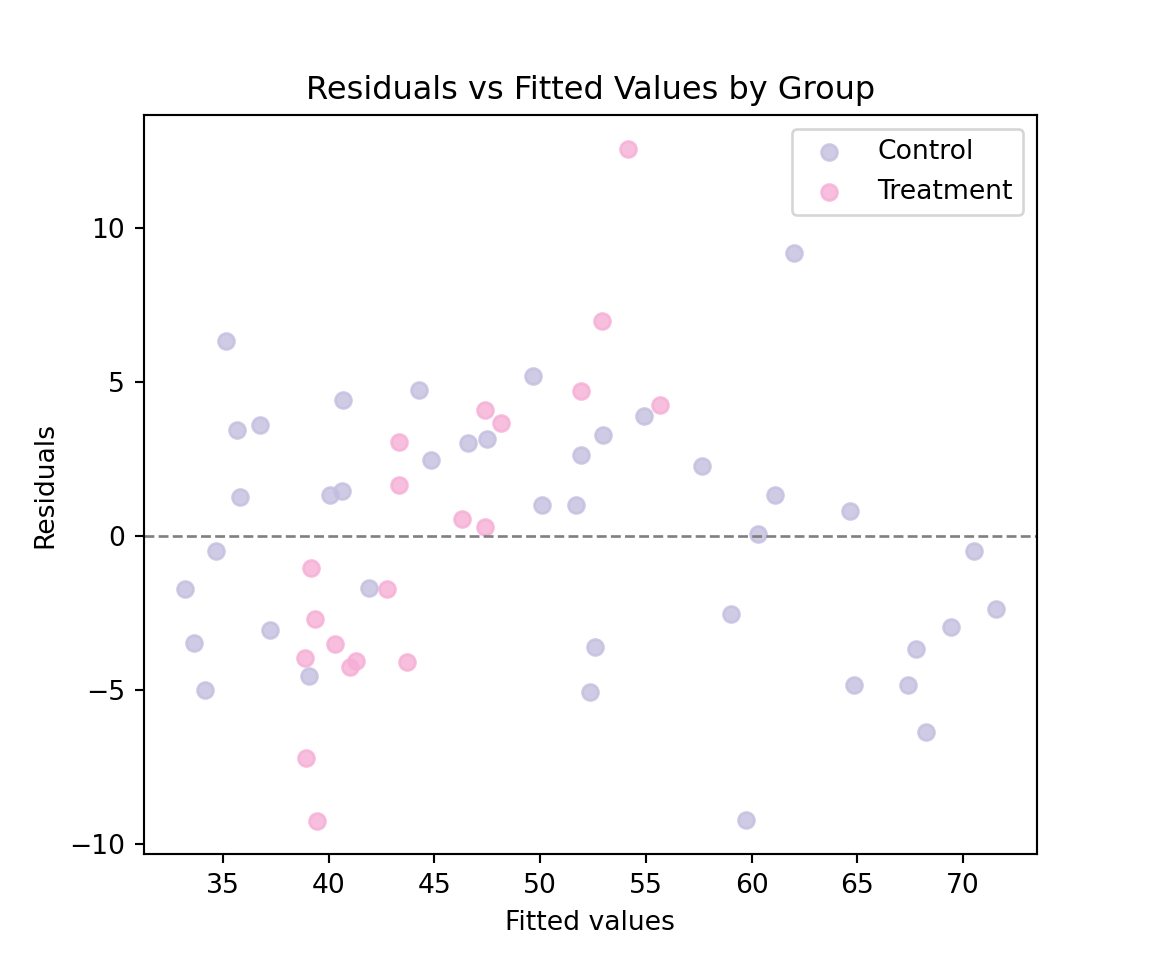
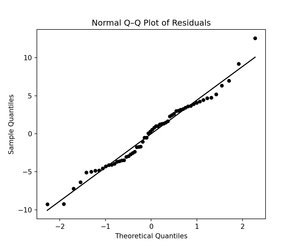
This graph clearly illustrates the limitation of our model. We can also construct a normal Q-Q plot to assess if the empirical distribution of the residuals is close to a normal distribution using the function stats.probplot:
import scipy.stats as stats
(osm, osr), (slope, intercept, r) = stats.probplot(residuals, dist="norm")
plt.figure(figsize=(6, 5))

# Black dots
plt.scatter(osm, osr, color='black', s=20)

# Black reference line
plt.plot(osm, slope * osm + intercept, color='black', linewidth=1.5)
plt.title("Normal Q–Q Plot of Residuals")
plt.xlabel("Theoretical Quantiles")
plt.ylabel("Sample Quantiles")
plt.show()