Example reading data: prediction

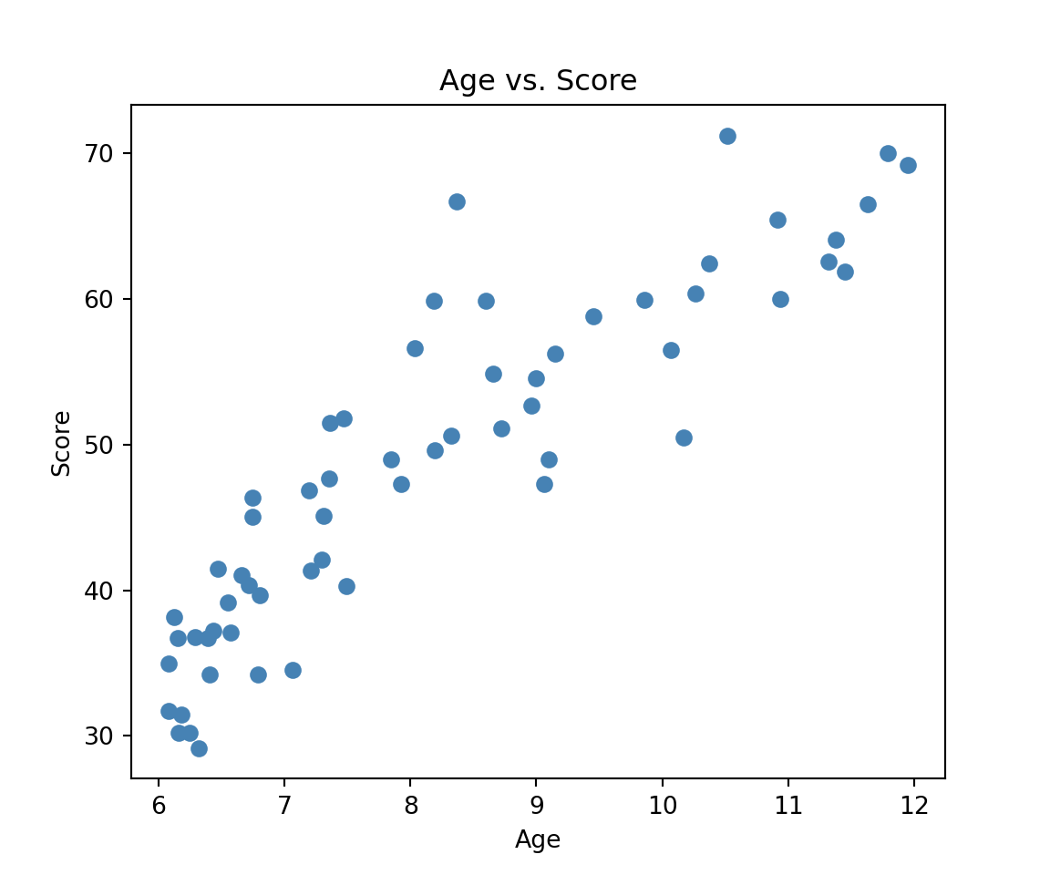
In order to assess the adequacy of our model to the data, it is useful (when this is possible) to compare the predictions and the data. This implies that we need to do two things: (1) plot the data with different colors for the groups and (2) compute predictions.

We can plot the data as follows:

import pandas as pd
import matplotlib.pyplot as plt
import statsmodels.formula.api as smf
import numpy as np

reading = pd.read_csv("https://raw.githubusercontent.com/ELSTE-Master/Data-Science/main/Data/reading.csv")

plt.figure(figsize=(6, 5))
# Scatter plot (no color coding by group)
plt.scatter(reading['age'], reading['score'], color='steelblue')

# Labels and title
plt.xlabel('Age')
plt.ylabel('Score')
plt.title('Age vs. Score')

plt.show()

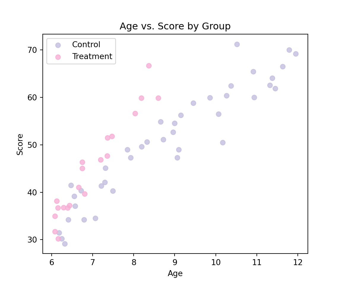
Next, we will highlight the different groups using two colors.

import matplotlib.pyplot as plt


# Define custom colors for each group
colors = {
    'Control': '#c4bedf',
    'Treatment': '#f6aed5'
}

plt.figure(figsize=(6, 5))

# Scatter plot by group with specific colors
for g in reading['group'].unique():
    subset = reading[reading['group'] == g]
    plt.scatter(subset['age'], subset['score'], label=g, color=colors[g], alpha=0.8)

# Labels and legend
plt.xlabel('Age')
plt.ylabel('Score')
plt.title('Age vs. Score by Group')
plt.legend()
plt.show()

# Fit the linear model: score ~ group + age
mod1 = smf.ols('score ~ group + age', data=reading).fit()
print(mod1.summary())
                            OLS Regression Results                            
==============================================================================
Dep. Variable:                  score   R-squared:                       0.859
Model:                            OLS   Adj. R-squared:                  0.854
Method:                 Least Squares   F-statistic:                     173.0
Date:                Wed, 12 Nov 2025   Prob (F-statistic):           6.16e-25
Time:                        11:11:25   Log-Likelihood:                -173.13
No. Observations:                  60   AIC:                             352.3
Df Residuals:                      57   BIC:                             358.6
Df Model:                           2                                         
Covariance Type:            nonrobust                                         
======================================================================================
                         coef    std err          t      P>|t|      [0.025      0.975]
--------------------------------------------------------------------------------------
Intercept             -7.8639      3.324     -2.366      0.021     -14.520      -1.208
group[T.Treatment]     6.3771      1.393      4.578      0.000       3.587       9.167
age                    6.6457      0.370     17.985      0.000       5.906       7.386
==============================================================================
Omnibus:                        0.633   Durbin-Watson:                   2.068
Prob(Omnibus):                  0.729   Jarque-Bera (JB):                0.386
Skew:                           0.196   Prob(JB):                        0.824
Kurtosis:                       3.013   Cond. No.                         50.7
==============================================================================

Notes:
[1] Standard Errors assume that the covariance matrix of the errors is correctly specified.

We can now compute predictions from our model. It can be observed that the age of the children ranges from 6 to 12 so our first step is to construct a sequence of numbers from 6 to 12 as follows:

age_to_predict = np.arange(6, 13) 
print(age_to_predict)
[ 6  7  8  9 10 11 12]

Then, using the output of the model we have that the predictions for the group “Control” are given by:

\[ \text { Predicted Score }_i=-7.8639+6.6457 \mathrm{Age}_i \]

This can be done as follows:

b0 = mod1.params['Intercept']
b_age = mod1.params['age']
b_group = mod1.params.get('group[T.Treatment]', 0)  # Treatment effect

# Predictions for Control group (no group effect)
prediction_control = b0 + b_age * age_to_predict
print(prediction_control)
[32.0101229  38.65578822 45.30145355 51.94711887 58.59278419 65.23844951
 71.88411484]

Alternatively, we can construct an pd.DataFrame with the data we would like to predict as follows:

# Data to predict for Control group
data_to_predict_control = pd.DataFrame({
    'age': age_to_predict,
    'group': ['Control'] * len(age_to_predict)
})

Then, we can use the method predict as follows:

prediction_control = mod1.predict(data_to_predict_control)
print(prediction_control)
0    32.010123
1    38.655788
2    45.301454
3    51.947119
4    58.592784
5    65.238450
6    71.884115
dtype: float64

This approach provides the same results but is more reliable. Similarly, we can compute the predictions for the other groups as follows:

# Data to predict for Treatment group
data_to_predict_treatment = pd.DataFrame({
    'age': age_to_predict,
    'group': ['Treatment'] * len(age_to_predict)
})

prediction_treatment = mod1.predict(data_to_predict_treatment)
print(prediction_treatment)
0    38.387192
1    45.032858
2    51.678523
3    58.324188
4    64.969854
5    71.615519
6    78.261184
dtype: float64

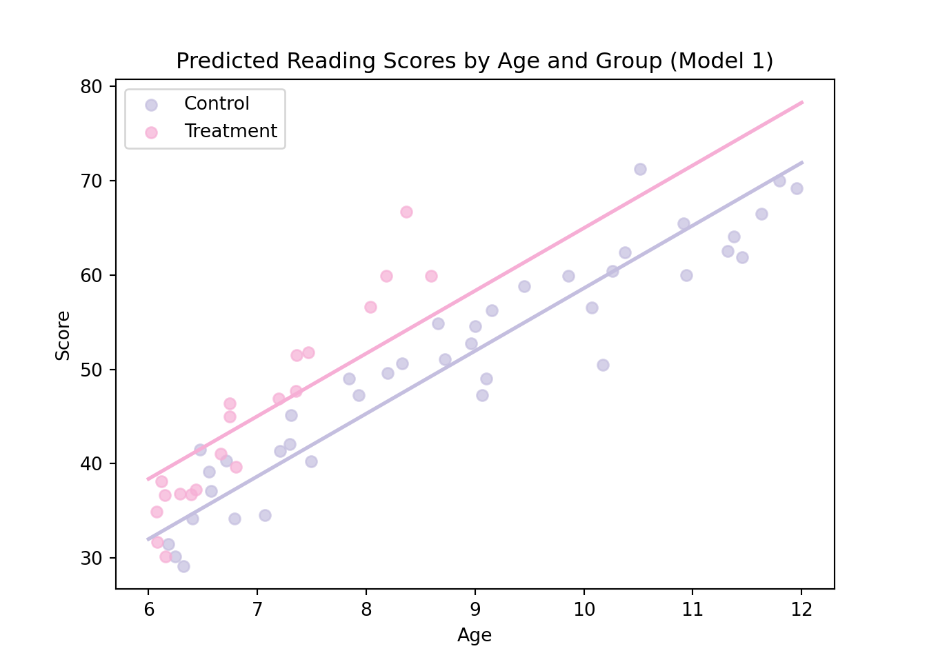
Now, we can add our predictions to the graph as follows:

# Define colors

colors = {
    'Control': '#c4bedf',
    'Treatment': '#f6aed5'
}
# Plot observed data
plt.figure(figsize=(7, 5))
for g in reading['group'].unique():
    subset = reading[reading['group'] == g]
    plt.scatter(subset['age'], subset['score'], color=colors[g], label=g, alpha=0.7)

# Add prediction lines
plt.plot(age_to_predict, prediction_control, color=colors['Control'], linewidth=2)
plt.plot(age_to_predict, prediction_treatment, color=colors['Treatment'], linewidth=2)

# Labels and legend
plt.xlabel("Age")
plt.ylabel("Score")
plt.title("Predicted Reading Scores by Age and Group (Model 1)")
plt.legend()
plt.show()

As discussed in the lecture slides, the adequacy between our predictions and the data is not ideal. To highlight the limitations of this model we will consider model diagnostic graphs in the next section.