# Import data
import pandas as pd
diet = pd.read_csv("https://raw.githubusercontent.com/ELSTE-Master/Data-Science/main/Data/diet.csv")Examples diet data part I
Comparing Diets A and B
Getting the data
In this exercise, we will replicate the diet data analysis example presented in the lectures slides, and we will compare diets A and B. Our first step is to load the data.
We can now take a look at the data.
# Import data
n = 5
print(diet.head(n)) #print the first n rows of the dataset
id gender age height diet.type initial.weight final.weight
0 1 Female 22 159 A 58 54.2
1 2 Female 46 192 A 60 54.0
2 3 Female 55 170 A 64 63.3
3 4 Female 33 171 A 64 61.1
4 5 Female 50 170 A 65 62.2To compare the effectiveness of the diets, we first compute the weight loss of the participants (i.e. initial weight - final weight), which can be done in Python as follows:
# Compute weight loss
diet["weight.loss"] = diet["initial.weight"] - diet["final.weight"]
For this example, we consider diets A and B so we construct our “variables of interest”, say dietA and dietB, by only selecting these diets. This can be done in Python as follows:
# Variable of interest
dietA = diet["weight.loss"][diet["diet.type"]=="A"]
dietB = diet["weight.loss"][diet["diet.type"]=="B"]
import matplotlib.pyplot as plt
import numpy as np
plt.figure(figsize=(6,4))
# Boxplot without outliers
plt.boxplot([dietA, dietB],
tick_labels=["Diet A", "Diet B"],
patch_artist=True,
boxprops=dict(facecolor="lightblue", color="blue"),
medianprops=dict(color="red"),
showfliers=False) # don't show outliers in boxplot{'whiskers': [<matplotlib.lines.Line2D object at 0x7aee0b7cb490>, <matplotlib.lines.Line2D object at 0x7aee0b7cb790>, <matplotlib.lines.Line2D object at 0x7aee0b61c640>, <matplotlib.lines.Line2D object at 0x7aee0b61c940>], 'caps': [<matplotlib.lines.Line2D object at 0x7aee0b7cba90>, <matplotlib.lines.Line2D object at 0x7aee0b7cbd90>, <matplotlib.lines.Line2D object at 0x7aee0b61cc40>, <matplotlib.lines.Line2D object at 0x7aee0b61cf40>], 'boxes': [<matplotlib.patches.PathPatch object at 0x7aee0b7cb040>, <matplotlib.patches.PathPatch object at 0x7aee0b61c070>], 'medians': [<matplotlib.lines.Line2D object at 0x7aee0b61c0d0>, <matplotlib.lines.Line2D object at 0x7aee0b61d240>], 'fliers': [], 'means': []}# Overlay all points with horizontal jitter
for i, data in enumerate([dietA, dietB], start=1):
x = np.random.normal(i, 0.09, size=len(data)) # jitter for visibility
plt.scatter(x, data, alpha=0.7, color='orange', edgecolor='k', zorder=10)
plt.ylabel("Weight loss (kg)")
plt.title("Comparison of Weight Loss for Diets A and B")
plt.show()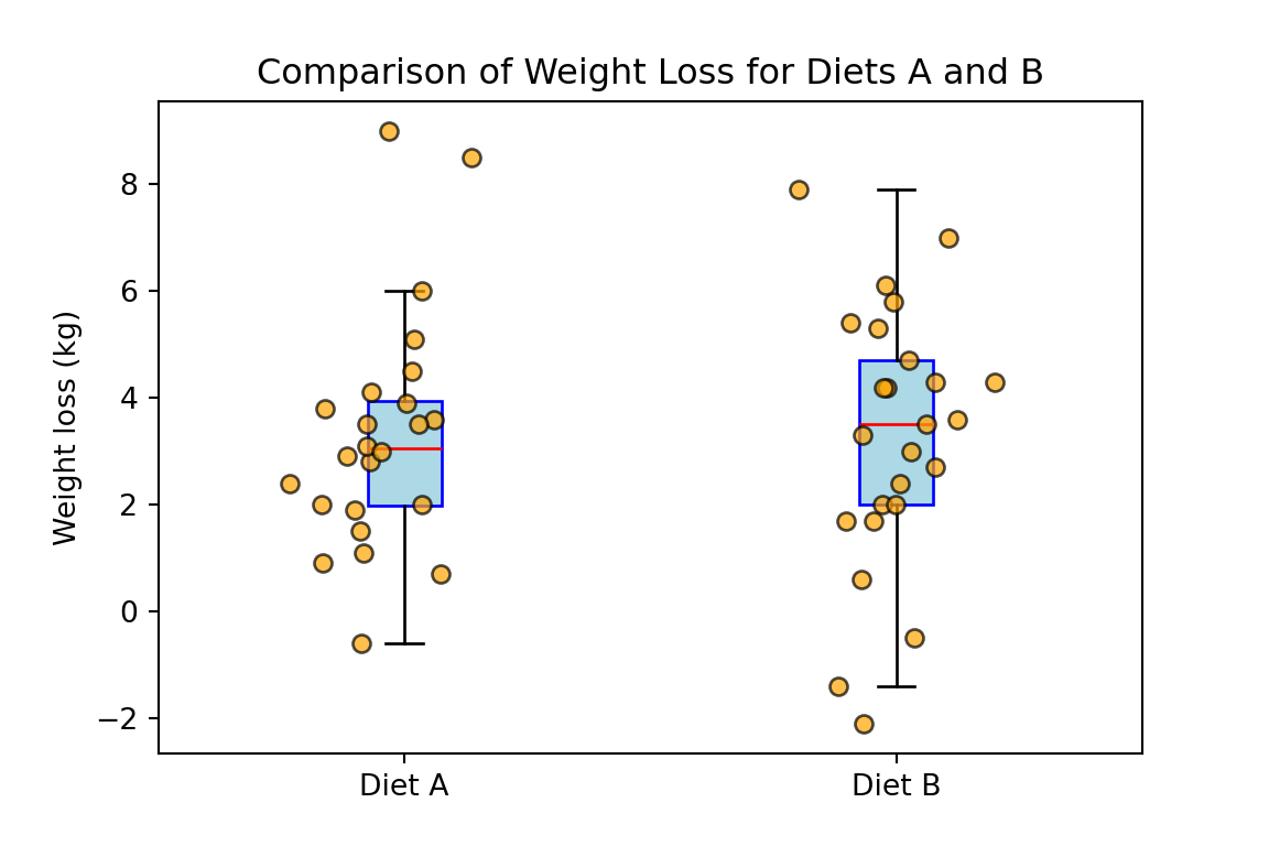
Based on the previous boxplot, Welch’s t-test or Wilcoxon rank sum test are both reasonable choices. For this example we will use the Welch’s t-test. To compare the effectiveness of diets A and B we start by defining the hypotheses:
\[H_{0}: \mu_A=\mu_B \quad \text{and} \quad H_{a}: \mu_A\neq\mu_B,\]
where \(\mu_A\) and \(\mu_B\) denote the mean weight loss for diets A and B, respectively. We consider \(\alpha = 0.05\) and compute the p-value as follows:
from scipy import stats

# Welch's t-test (equal_var=False makes it Welch)
t_stat, p_value = stats.ttest_ind(dietA, dietB, equal_var=False)

print("t-statistic:", round(t_stat, 4))
t-statistic: 0.0476print("p-value:", round(p_value, 4))p-value: 0.9622Since the p-value is equal to \(96.22\%\) which is larger than \(5\%\), we fail to reject the null hypothesis at the \(95\%\) confidence level.