# Load Pandas
import pandas as pd # Import pandas

# Import the dataset specifying which Excel sheet name to load the data from
df_majors = pd.read_csv('https://raw.githubusercontent.com/ELSTE-Master/Data-Science/main/Data/Smith_glass_post_NYT_data_majors.csv')
df_traces = pd.read_csv('https://raw.githubusercontent.com/ELSTE-Master/Data-Science/main/Data/Smith_glass_post_NYT_data_traces.csv')Exploratory data analysis
How to start making data talk
Sébastien Biass 
Earth Sciences
Stéphane Guerrier
Earth Sciences
Pharmaceutical Sciences
October 22, 2025
Case study
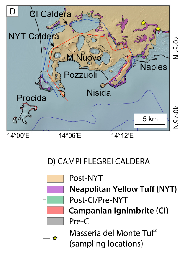
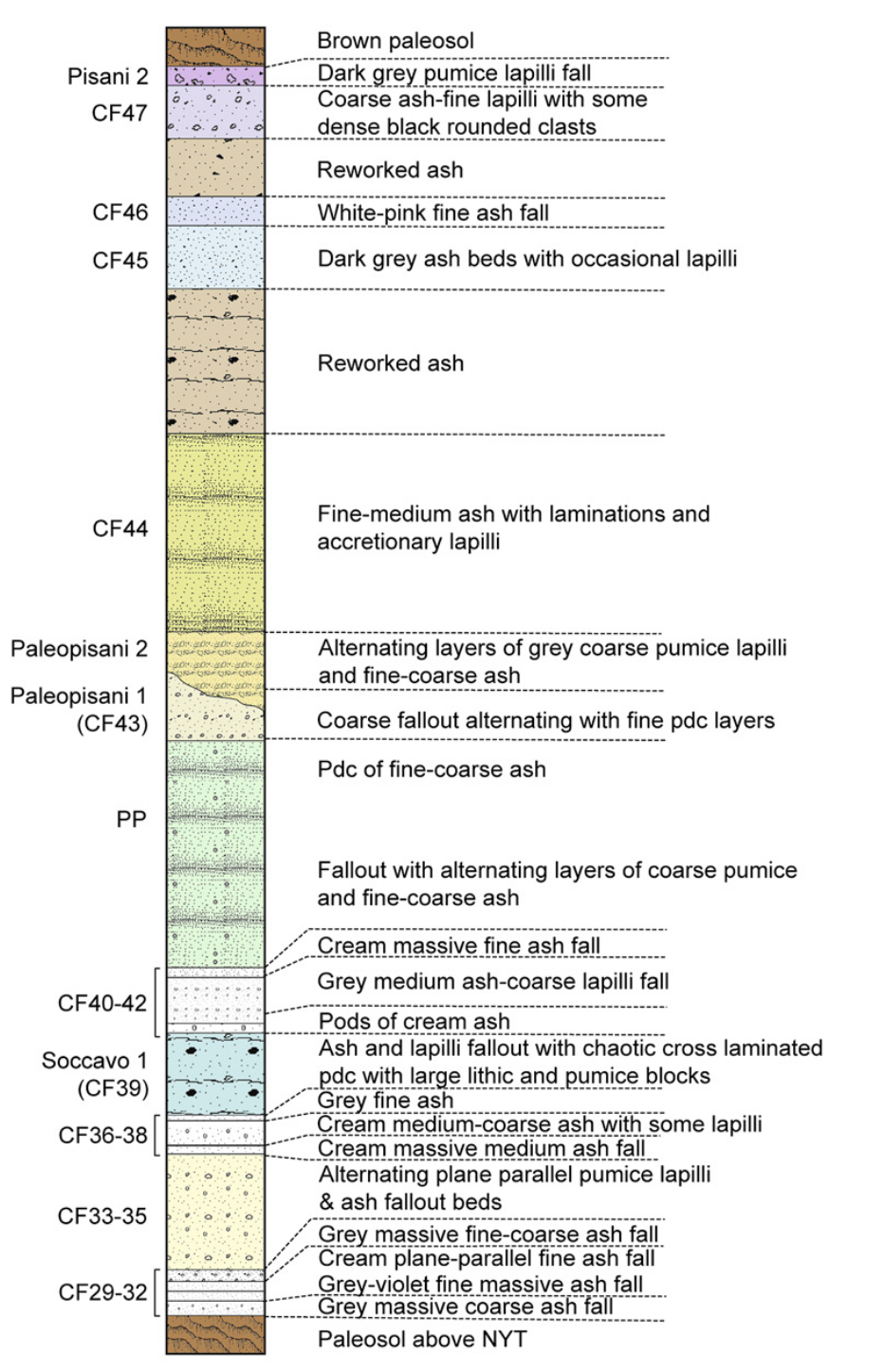
- Campi Flegrei: Home to 1.5 million people
- Caldera-forming eruptions
- Campanian Ignimbrite (CI), ~39 ka ago
- Neapolitan Yellow Tuff (NYT), ~15 ka ago

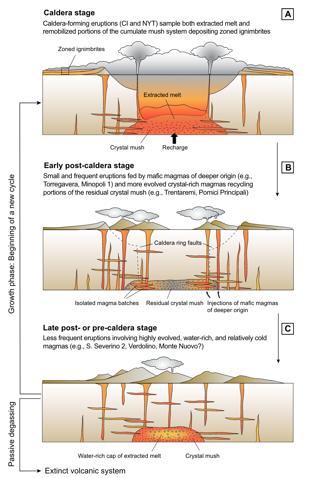
Caldera-forming eruptions cycles
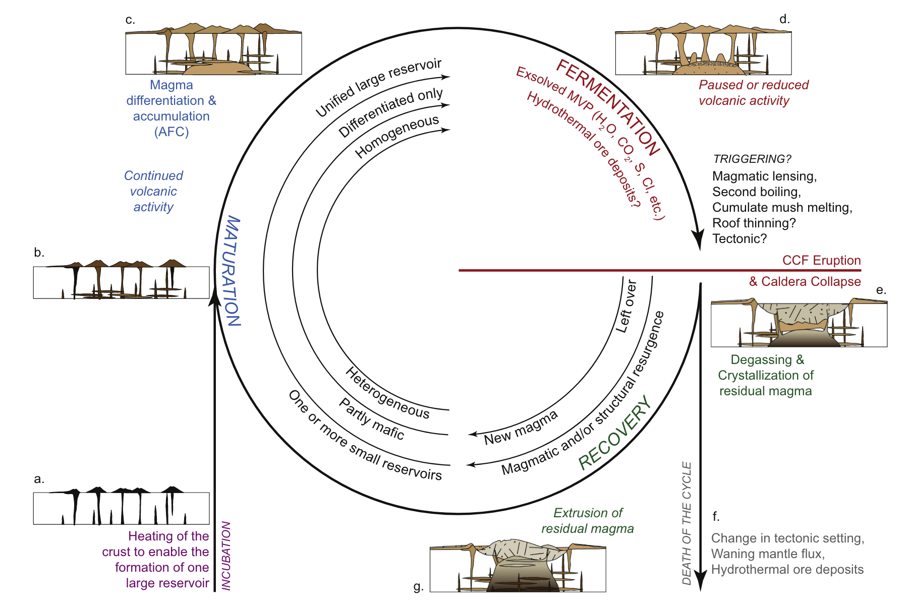
Bouvet de Maisoneuve et al. (2021)
Caldera cycles at Campi Flegrei
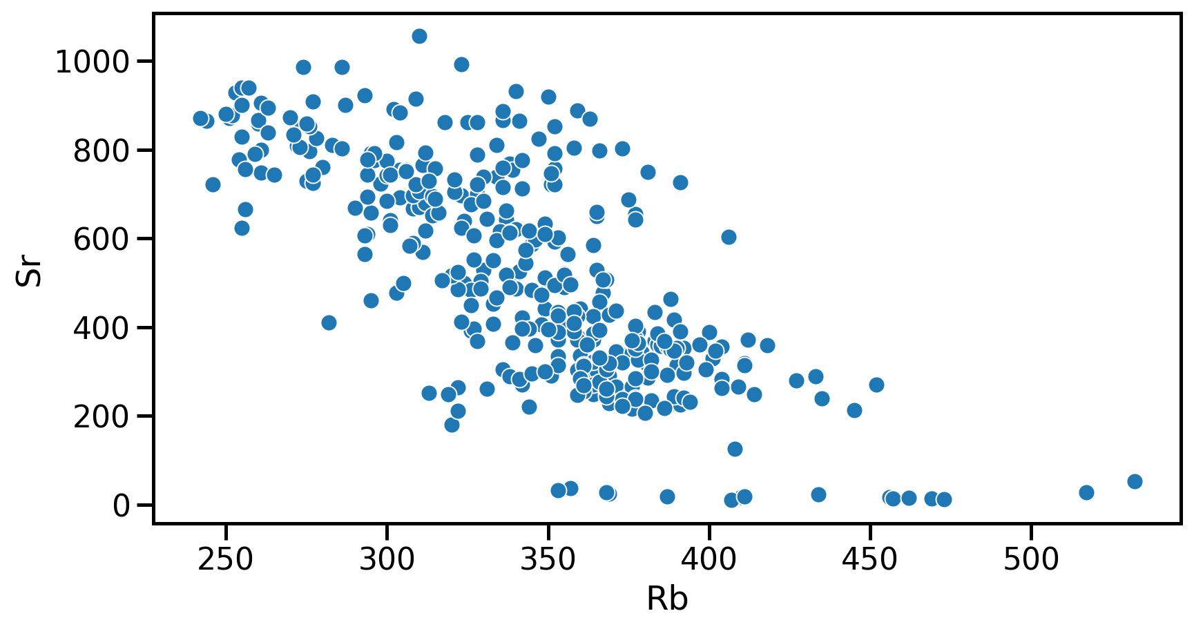
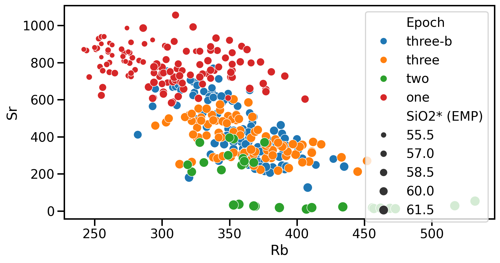
Dataset
Tephrostratigraphy and glass compositions of post-15 kyr Campi Flegrei eruptions
- Smith et al. (2011)
- Major and trace elements
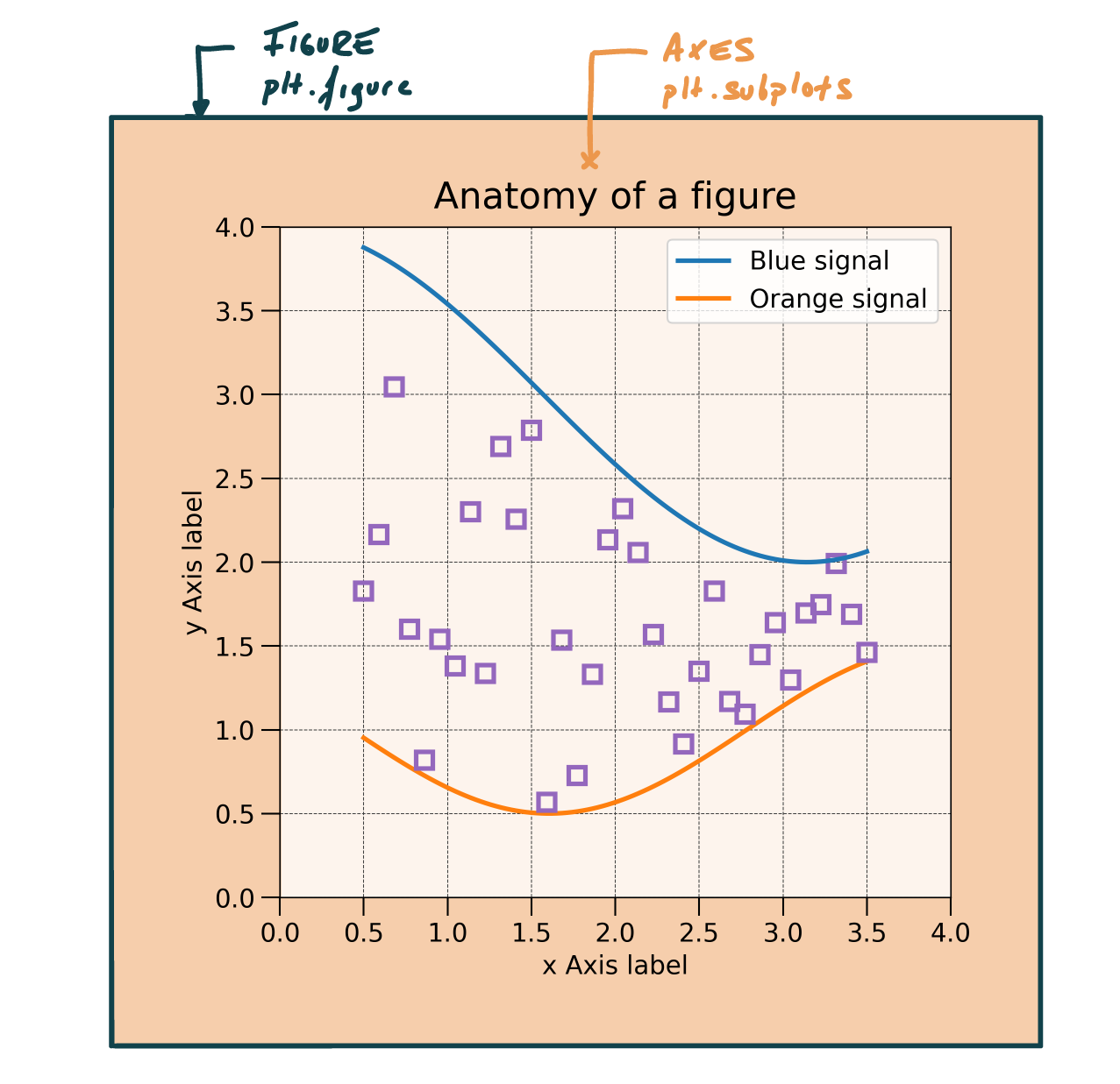
Anatomy of a figure
Anatomy of a axes
Axes: Where most of the magic occurs
| Function | Description |
|---|---|
ax.set_title |
Sets the title of the axes |
ax.set_xlabel |
Sets the label for the x-axis |
ax.set_ylabel |
Sets the label for the y-axis |
ax.legend |
Displays the legend |
ax.grid |
Shows grid lines |
Plotting example
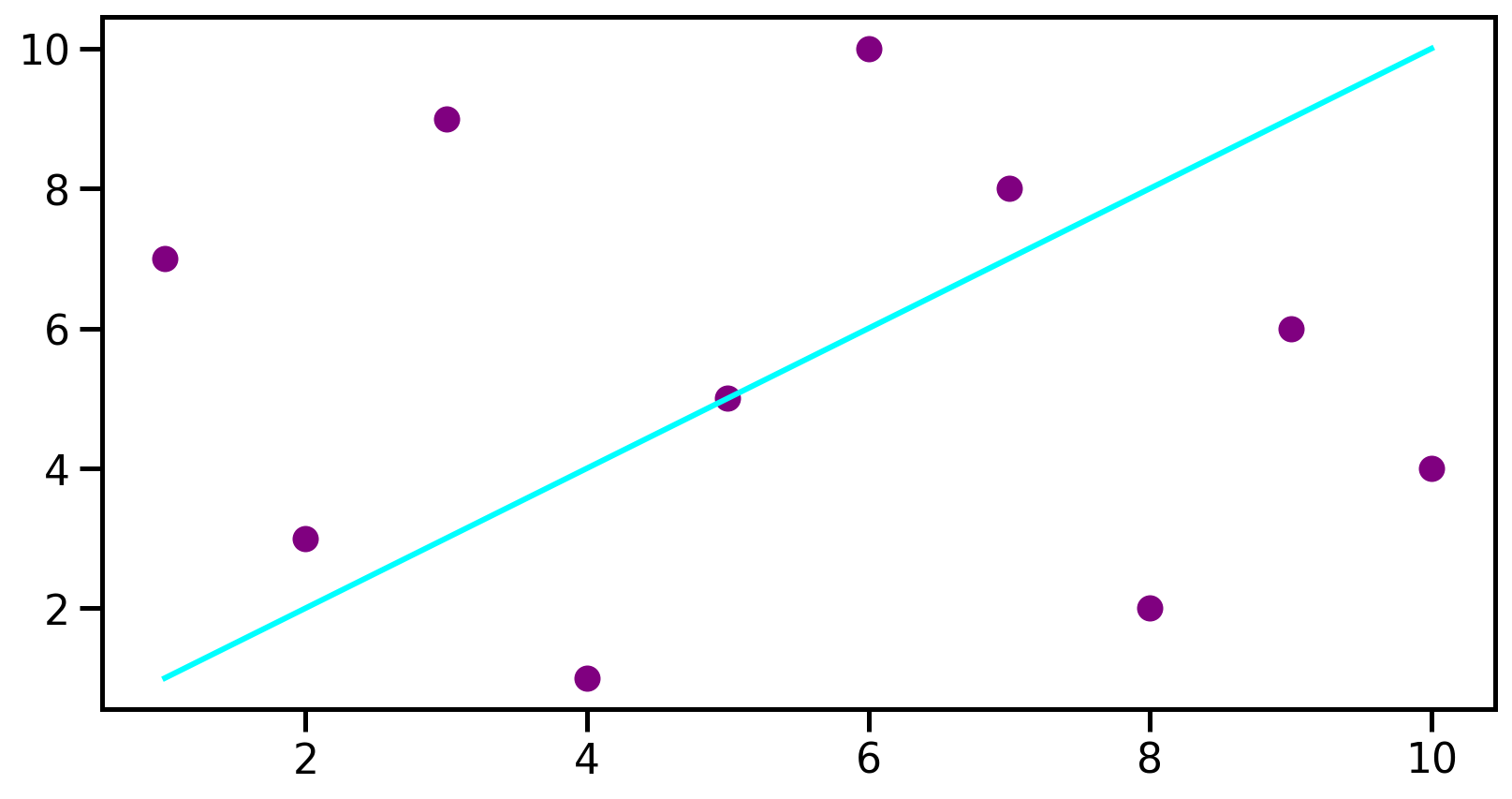
Plotting example
# Define some data
data1 = [1, 2, 3, 4, 5, 6, 7, 8, 9, 10]
data2 = [7, 3, 9, 1, 5, 10, 8, 2, 6, 4]

# Set the figure and the axes
fig, ax = plt.subplots()

# Plot the data
ax.plot(data1, data1, color='aqua', label='Line')
ax.scatter(data1, data2, color='purple', label='scatter')
# Set labels
ax.set_xlabel('x Label')
ax.set_ylabel('y Label')
# Only to make it look pretty on the presentation
plt.show()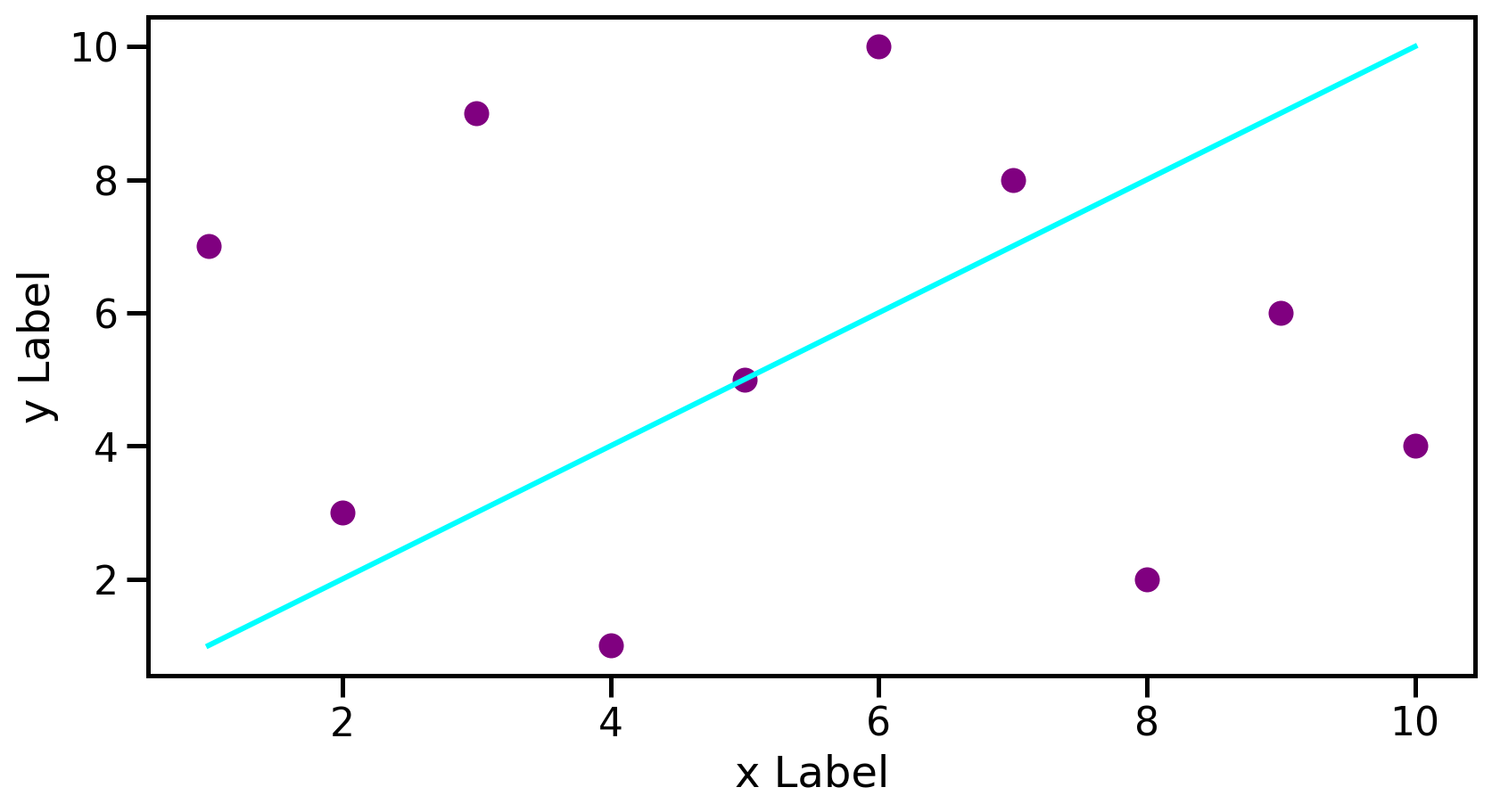
Seaborn example
Seaborn example
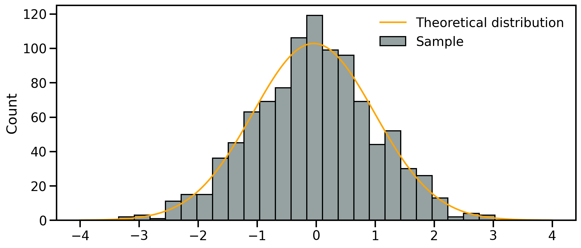
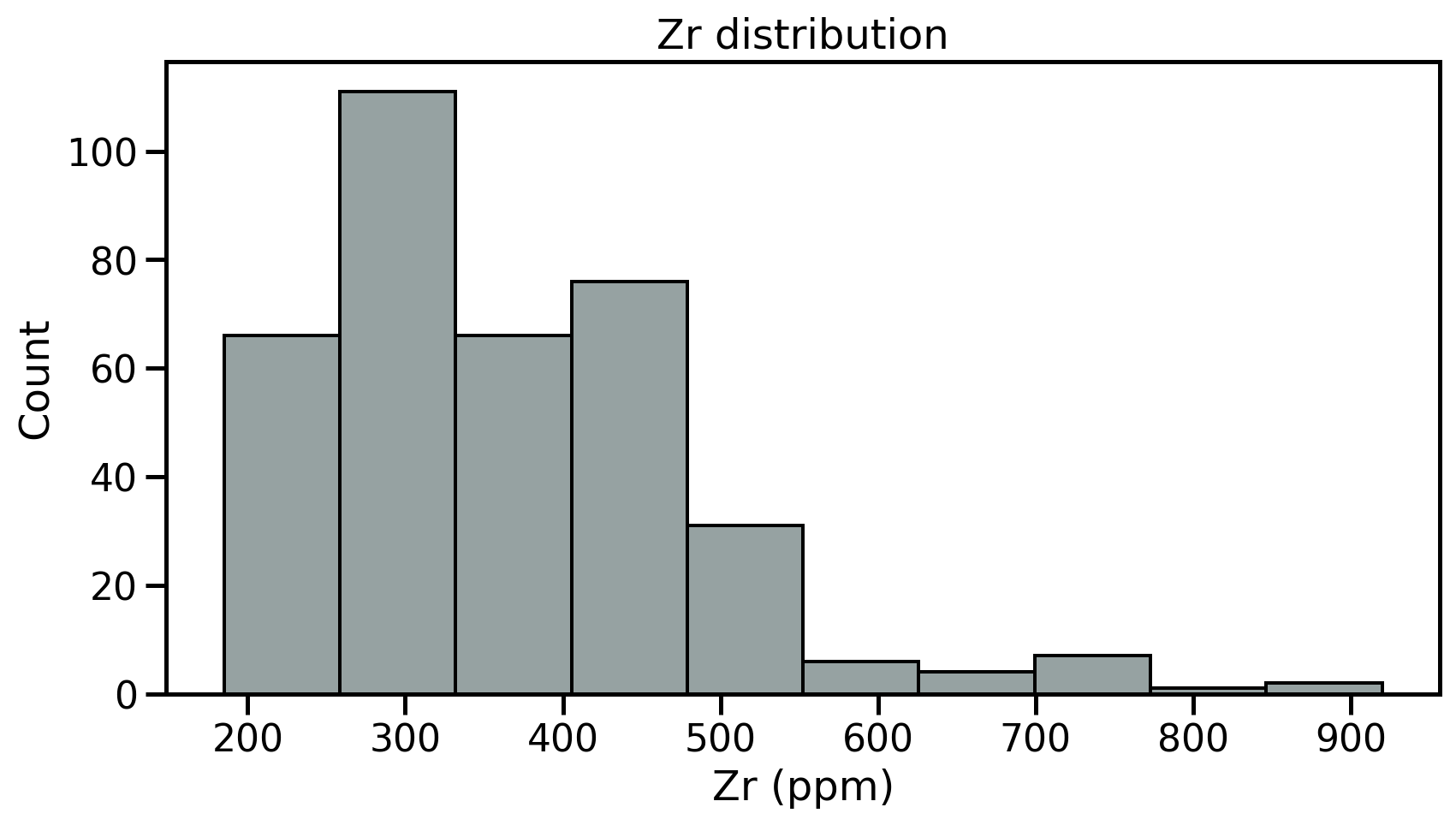
Univariate analyses
- Objective capturing the properties of single variables at the time
- Fist step: review the samples distribution using histograms
- Divides dataset into equal intervals → bins
- Counts the value in each bin
- Represents the distribution of data
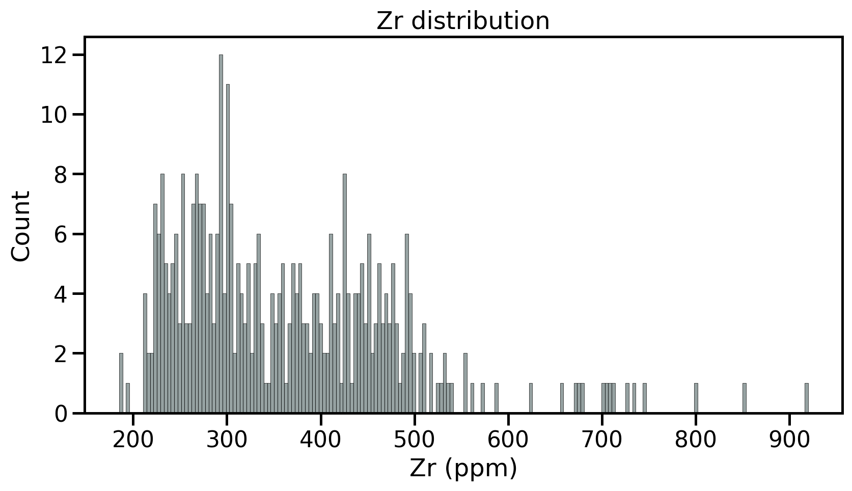
Univariate analyses
- Objective capturing the properties of single variables at the time
- Fist step: review the samples distribution using histograms
- Divides dataset into equal intervals → bins
- Counts the value in each bin
- Represents the distribution of data

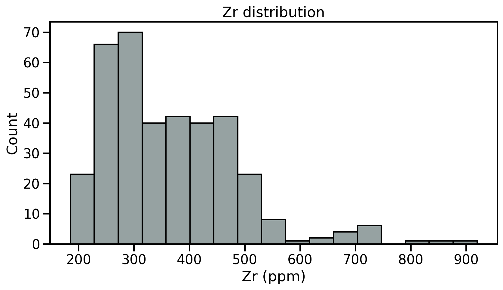
Univariate analyses
- Objective capturing the properties of single variables at the time
- Fist step: review the samples distribution using histograms
- Divides dataset into equal intervals → bins
- Counts the value in each bin
- Represents the distribution of data
Univariate analyses
- Objective capturing the properties of single variables at the time
- Fist step: review the samples distribution using histograms
- Divides dataset into equal intervals → bins
- Counts the value in each bin
- Represents the distribution of data
Descriptive parameters
Intuitive importance of describing three different characteristics of the distribution:
- The location - or where is the central value(s) of the dataset;
- The dispersion - or how spread out is the distribution of data compared to the central values;
- The skewness - or how symmetrical is the distribution of data compared to the central values;
Descriptive parameters
- Ideally → able to constrain full distributions of \(X\)
- theoretical moments
- In practice → only observe a finite sample of \(X\)
- estimators
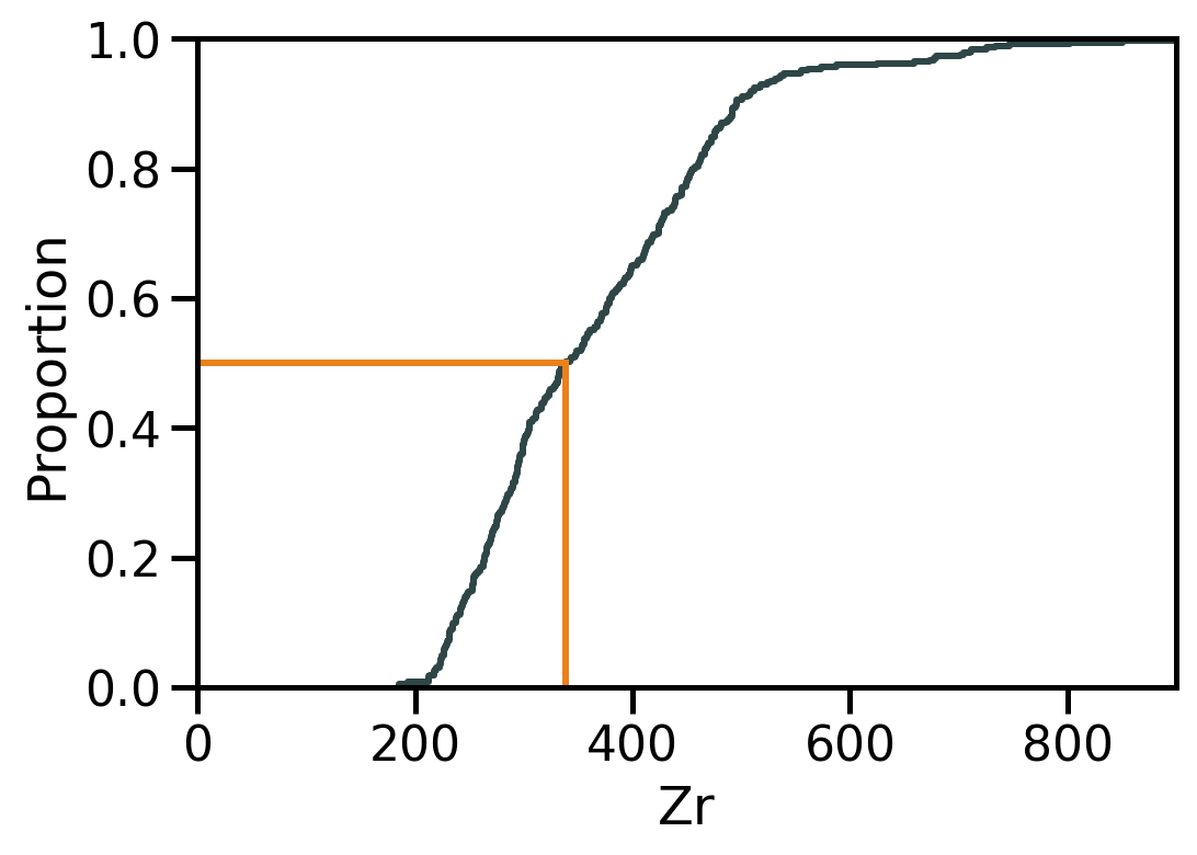
Location II: Median
The median is the value at the exact middle of the dataset.
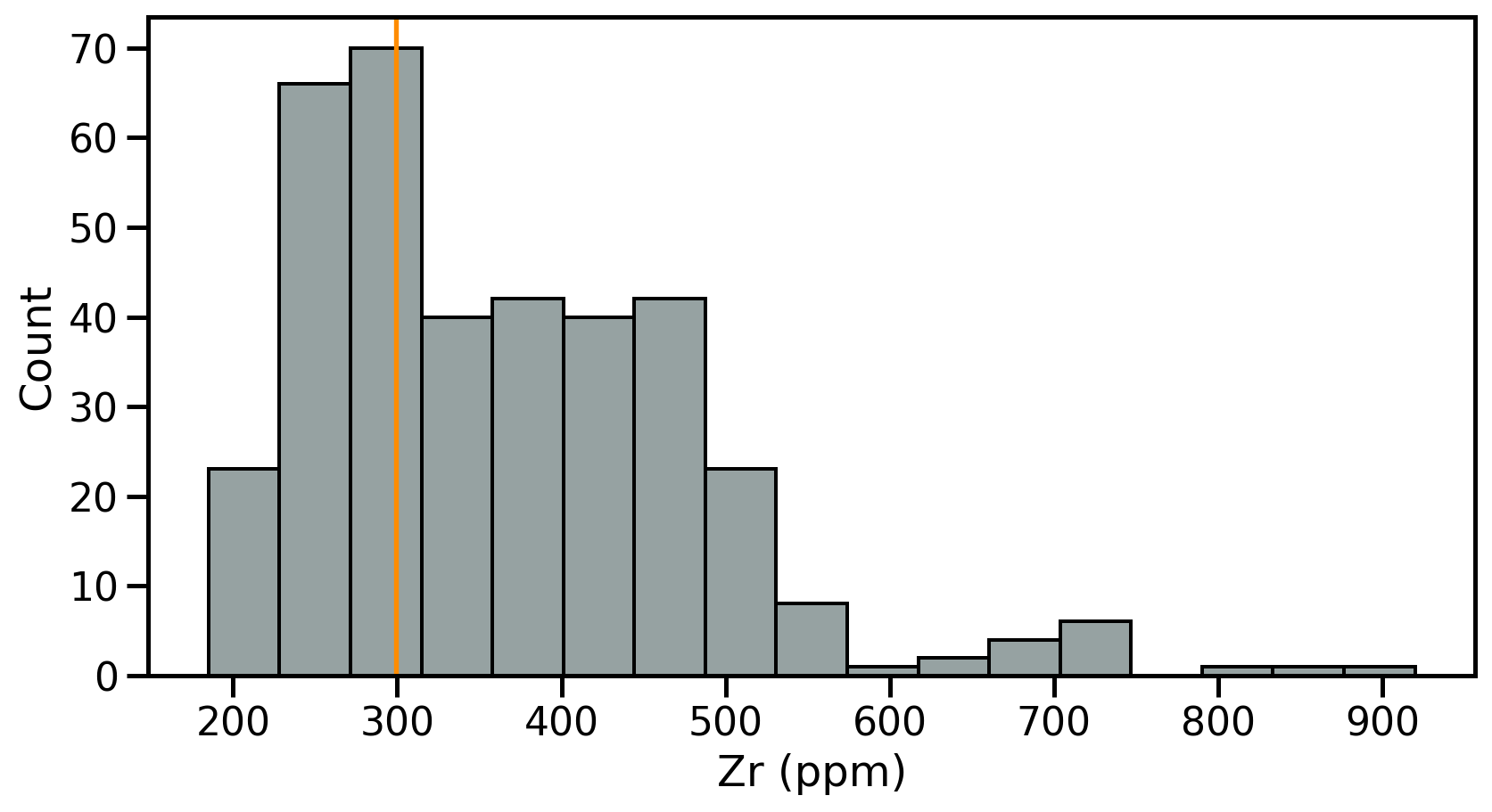
Location III: Mode
The mode is the value that occur most frequently in a dataset.
- Categorical or discrete numerical data: value(s) that appear most often.
- For continuous data, exact duplicates may be rare
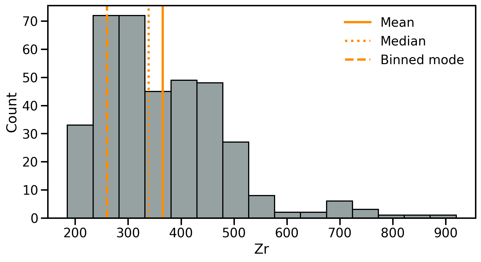
Location: Summary
- Mean: Best for symmetric distributions
- Sensitive to outliers
- Median: Best for skewed or outlier-prone data
- Only based on rank, not magnitude
- Mode: Best for describing the most frequent range in grouped or categorical-like data.
- Otherwise requires binning
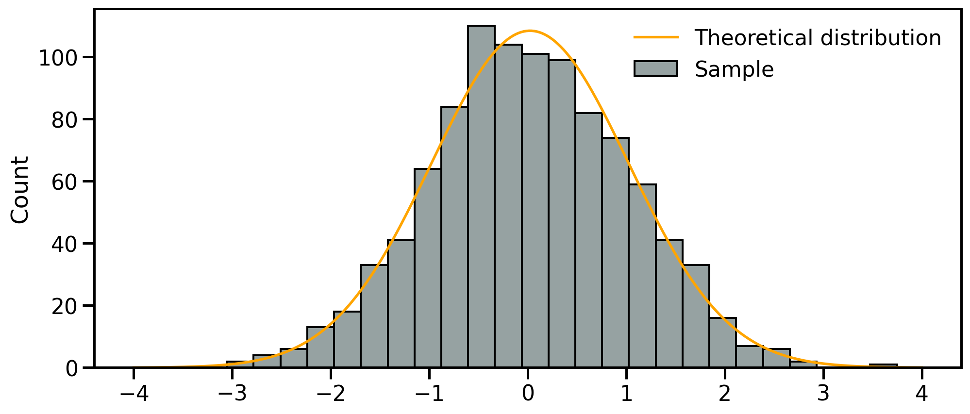
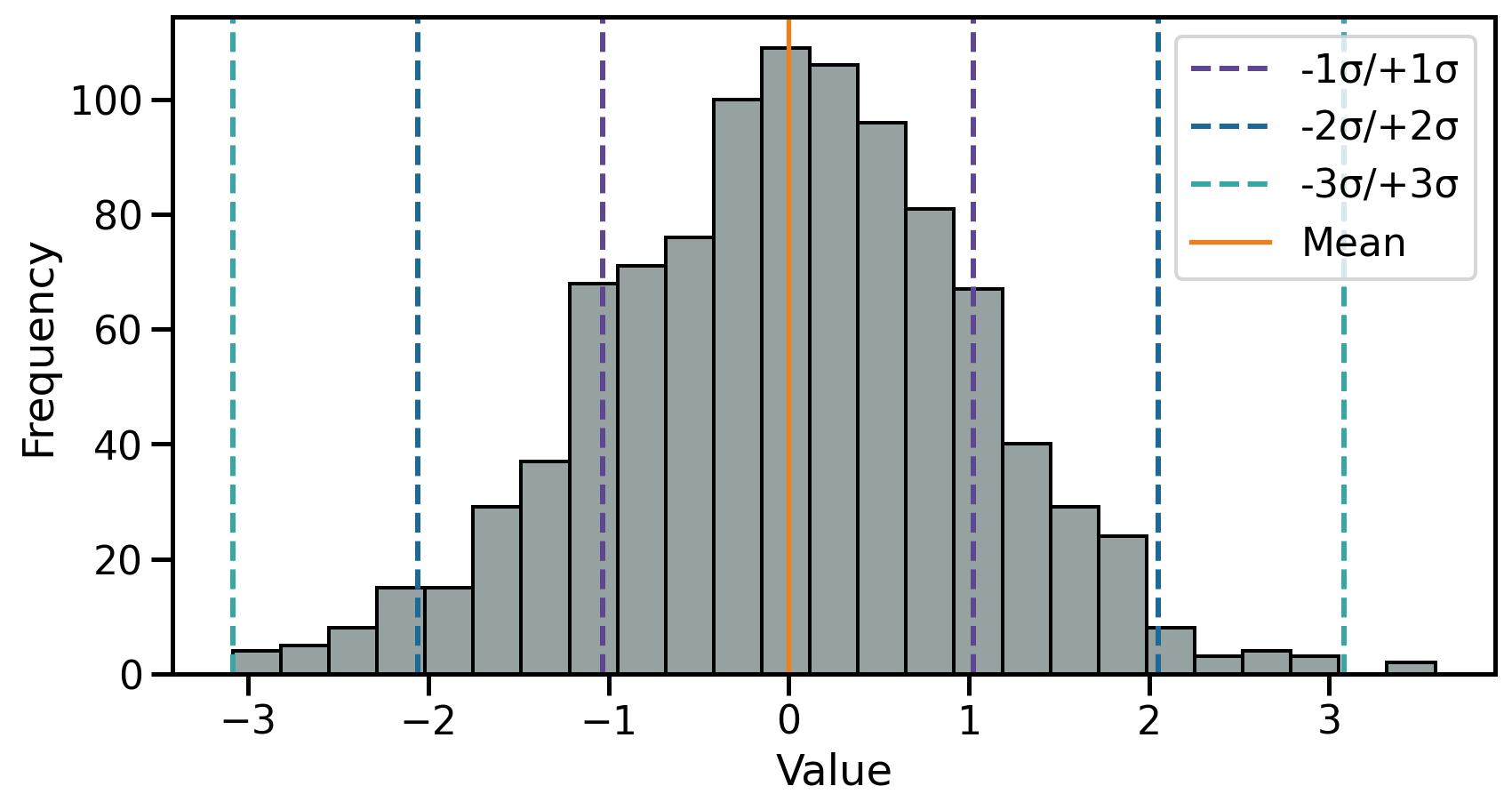
Dispersion 2: Standard deviation
The theoretical standard deviation (\(\sigma\)) is closely related to the normal distribution as:
- \(1\sigma\) → ~68% of the data
- \(2\sigma\) → ~95% of the data
- \(3\sigma\) → ~99.7% of the data
Dispersion 3: Interquartile range
The interquartile range (IQR) indicates how spread out the middle 50% of the data is.
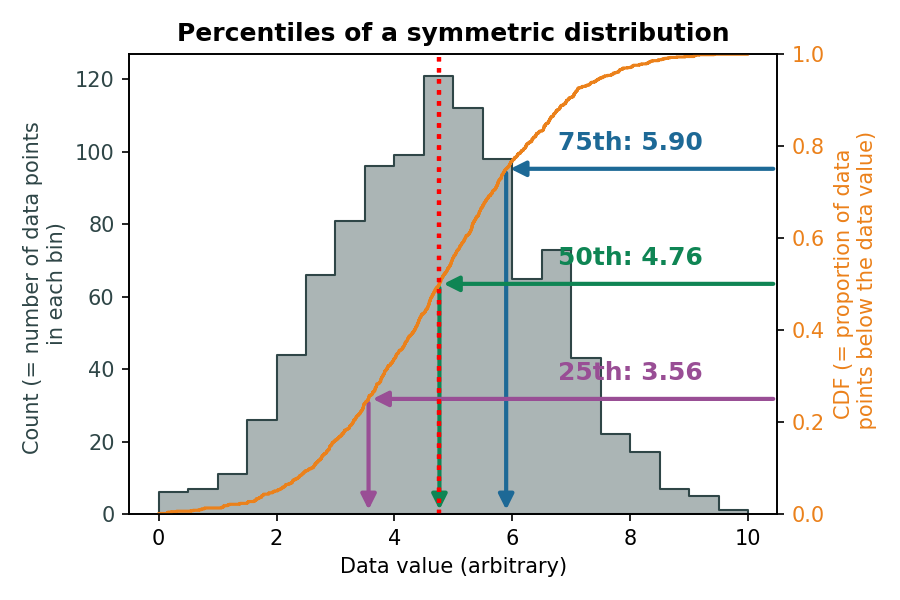
\(Q_1\) and \(Q_3\) for a symmetrical distribution:
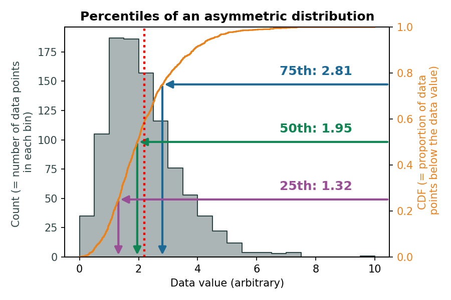
\(Q_1\) and \(Q_3\) for an asymmetrical distribution:
Distribution visualisation
Beyond histograms → some plot types report empirical indications of location, dispersion and skewness.
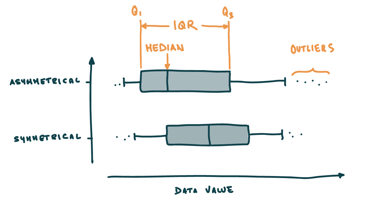
Box and whisker plots
- Box → \(IQR\) + median
- Whiskers 1.5 times the IQR from Q1/Q3
- Outlier → differs from the majority of observations
Distribution visualisation: Box plots
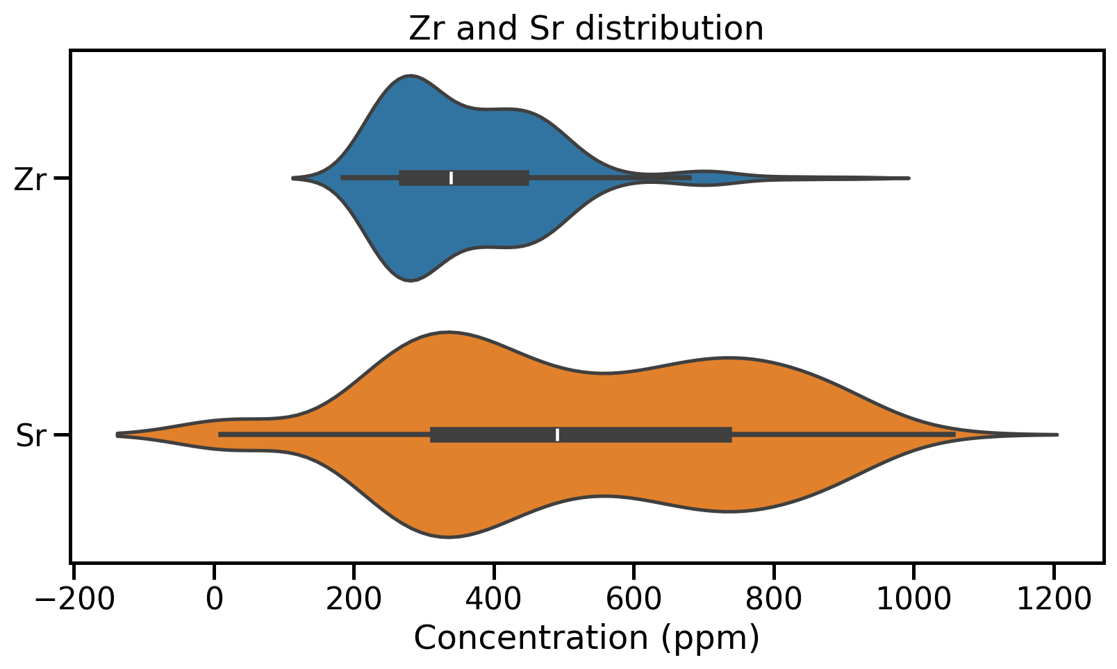
Distribution visualisation: Violin plots
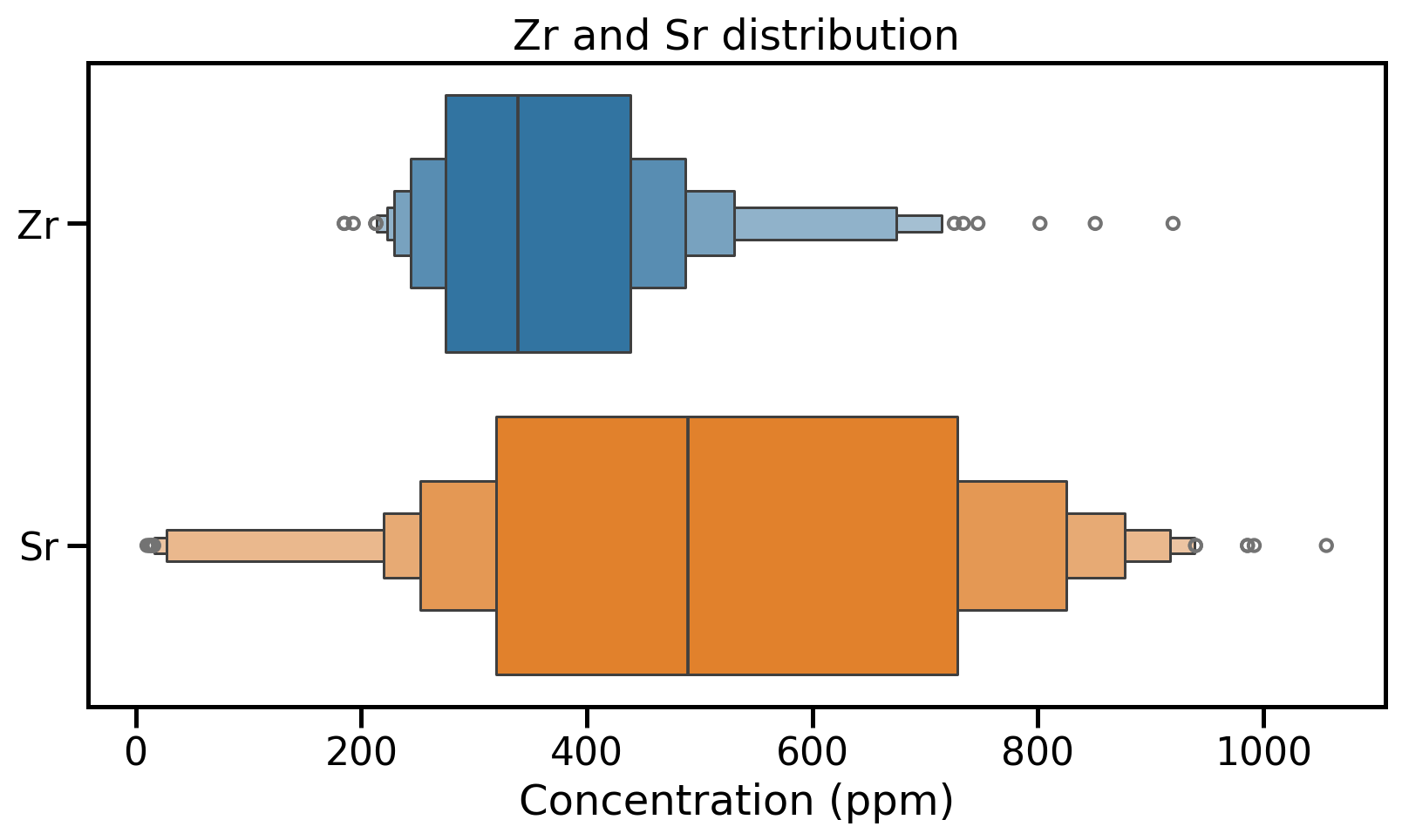
Distribution visualisation: Boxen plots
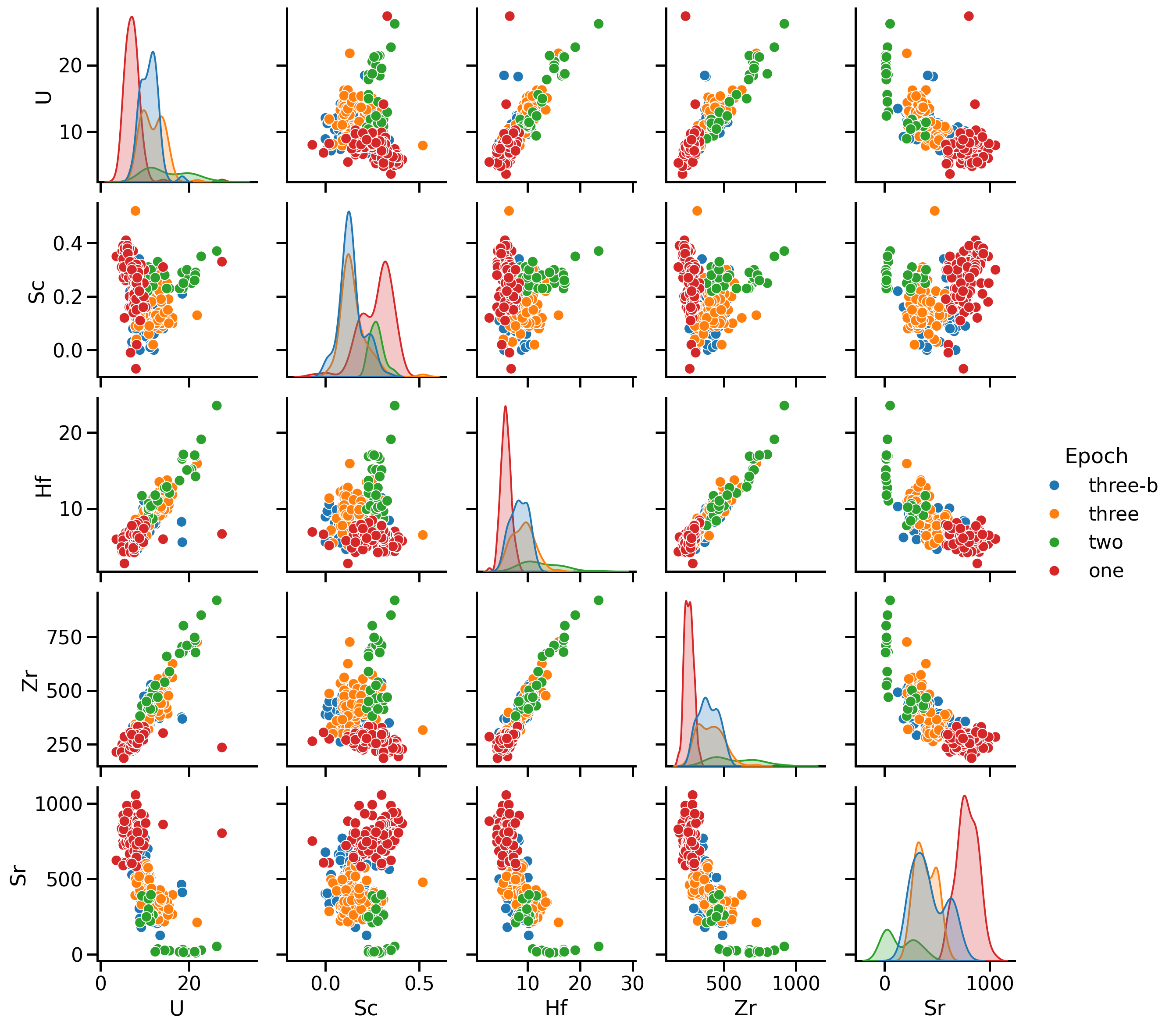
Pairwise comparison
A first visual inspection using sns.pairplot()
- Numerical values
- One categorical value
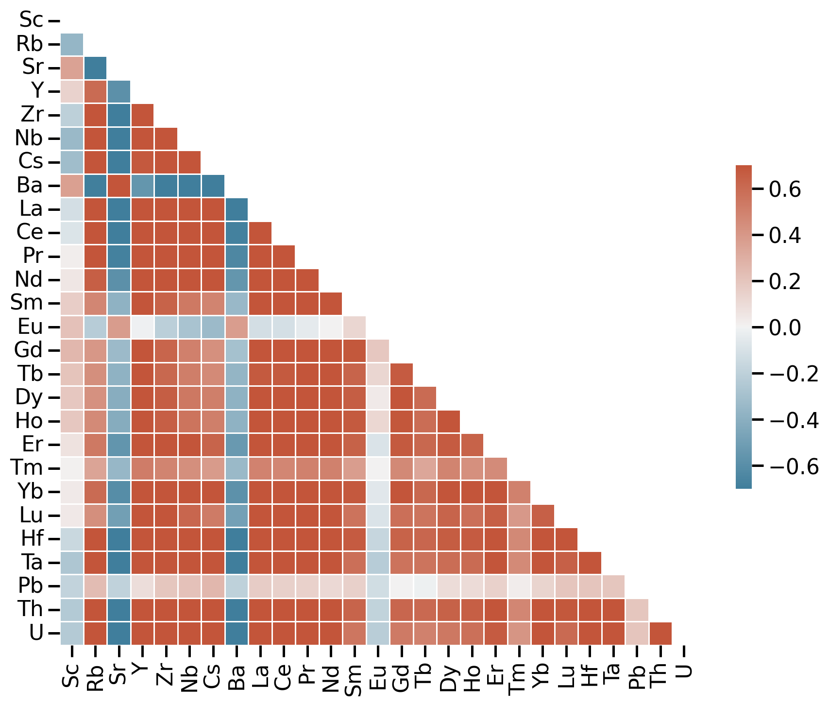
Correlation matrix
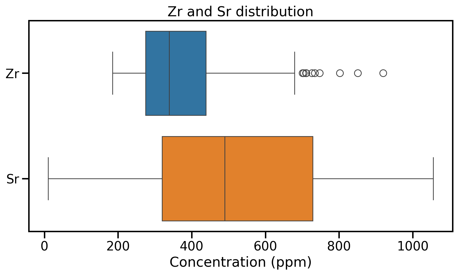
Correlation matrix for trace elements
- Use sample correlation coefficient \(r\)
- Red: positive relationship
- Blue: negative relationship
- White: no relationship
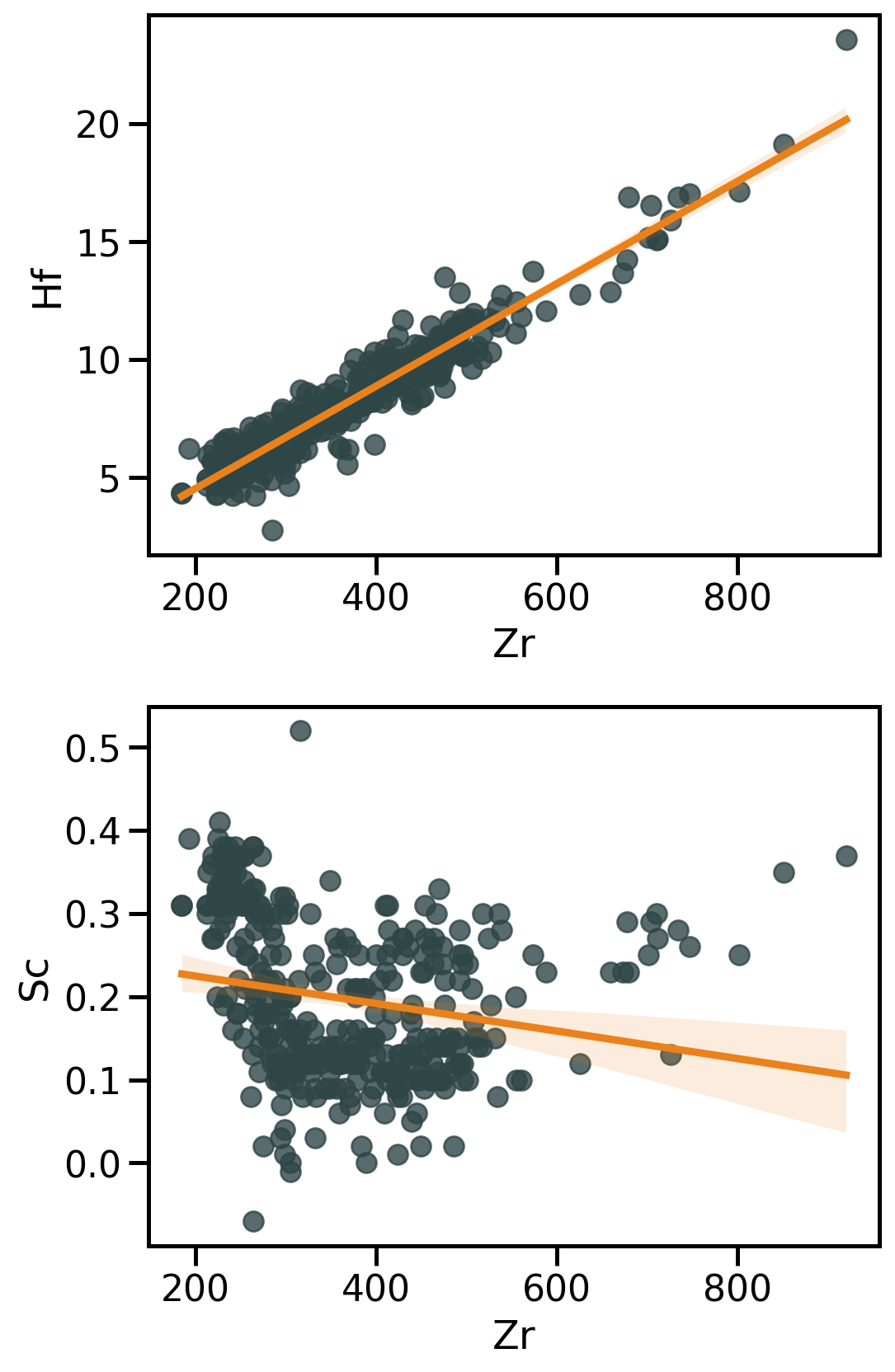
Linear regression with Seaborn
Seaborn has high level functions to visualise regressions → sns.regplot() that produce:
- A scatter plot;
- A linear regression model fit;
- A confidence interval
→ Be critical
→ Further investigations require dedicated stats packages
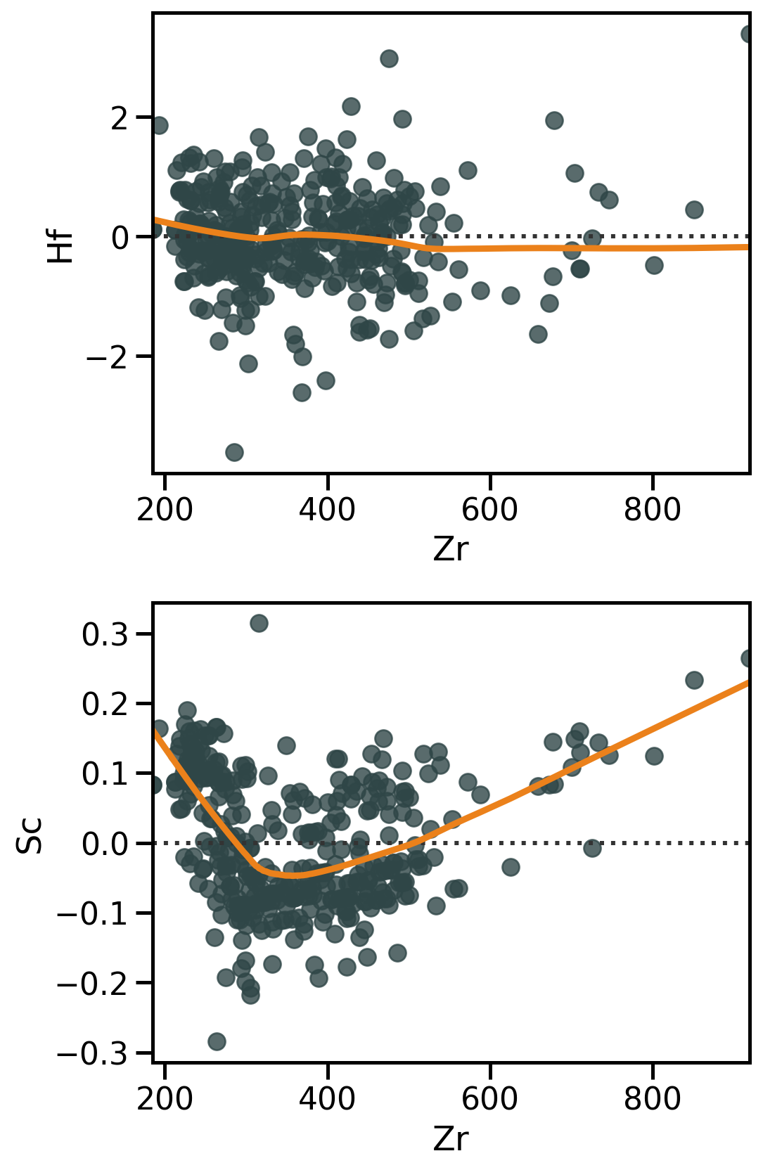
Residual analysis with Seaborn
Linear regression → do residuals show any structure?? → sns.residplot()
Residuals are necessary to:
- Diagnose model fit (→ how much unexplained variation remains);
- Detect patterns that indicate problems (non-linearity, heteroscedasticity, outliers).
Any type of structure in residuals might reveal a violation of linear regression assumptions.